Strider Project Management
Brand Identity
South Florida's residential construction market has no shortage of builders. What's missing is ownership—someone accountable to make sure everything runs smoothly. Strider was built to fill that space, serving as the bridge between design and execution for clients who have the vision and the resources but need a trusted partner to see it through.
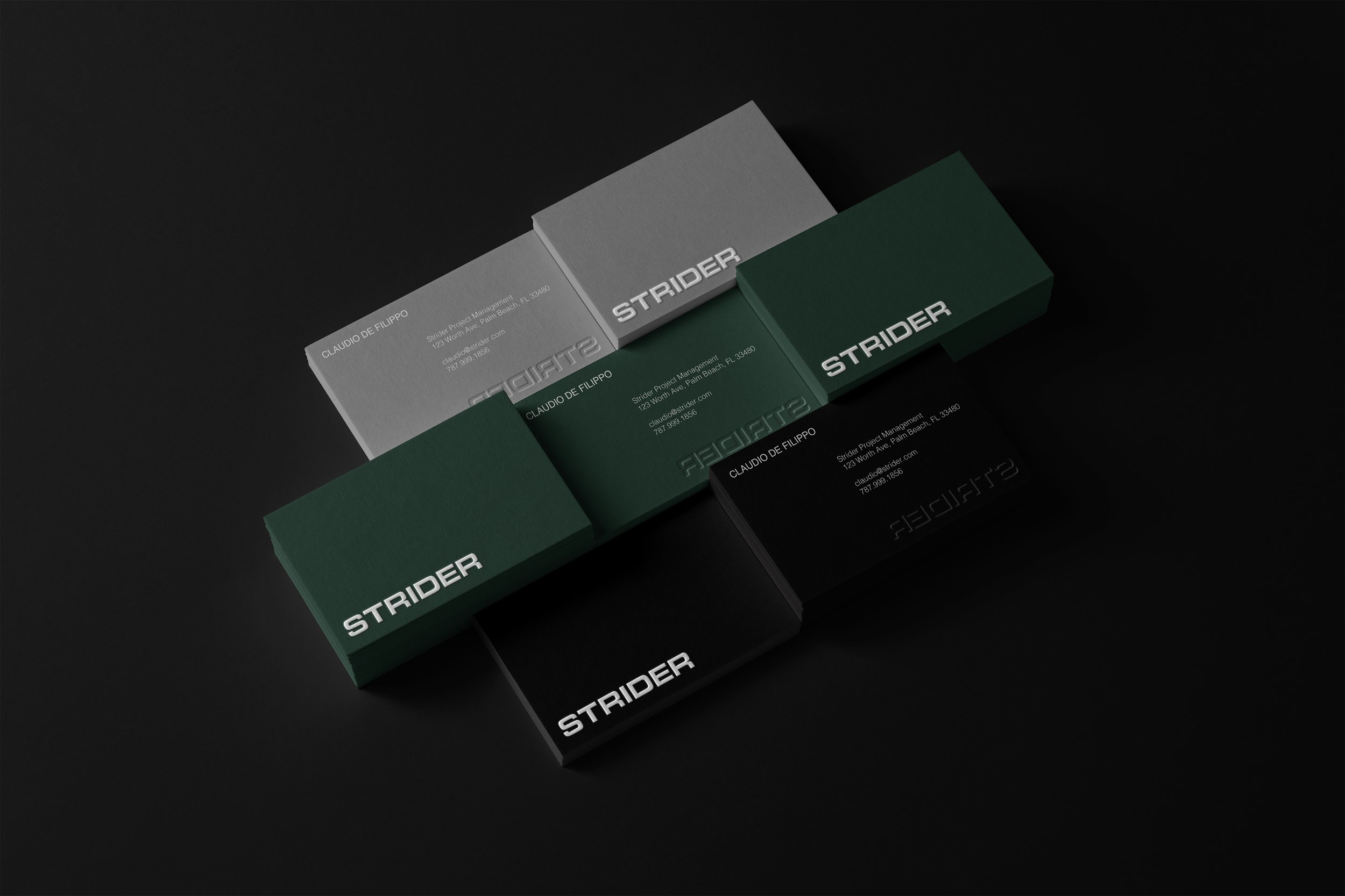
Through our discovery process, three things became clear: the brand needed to feel established, masculine, and clean. Despite being a newcomer to the South Florida market, it needed to emphasize the management team’s decades of experience.
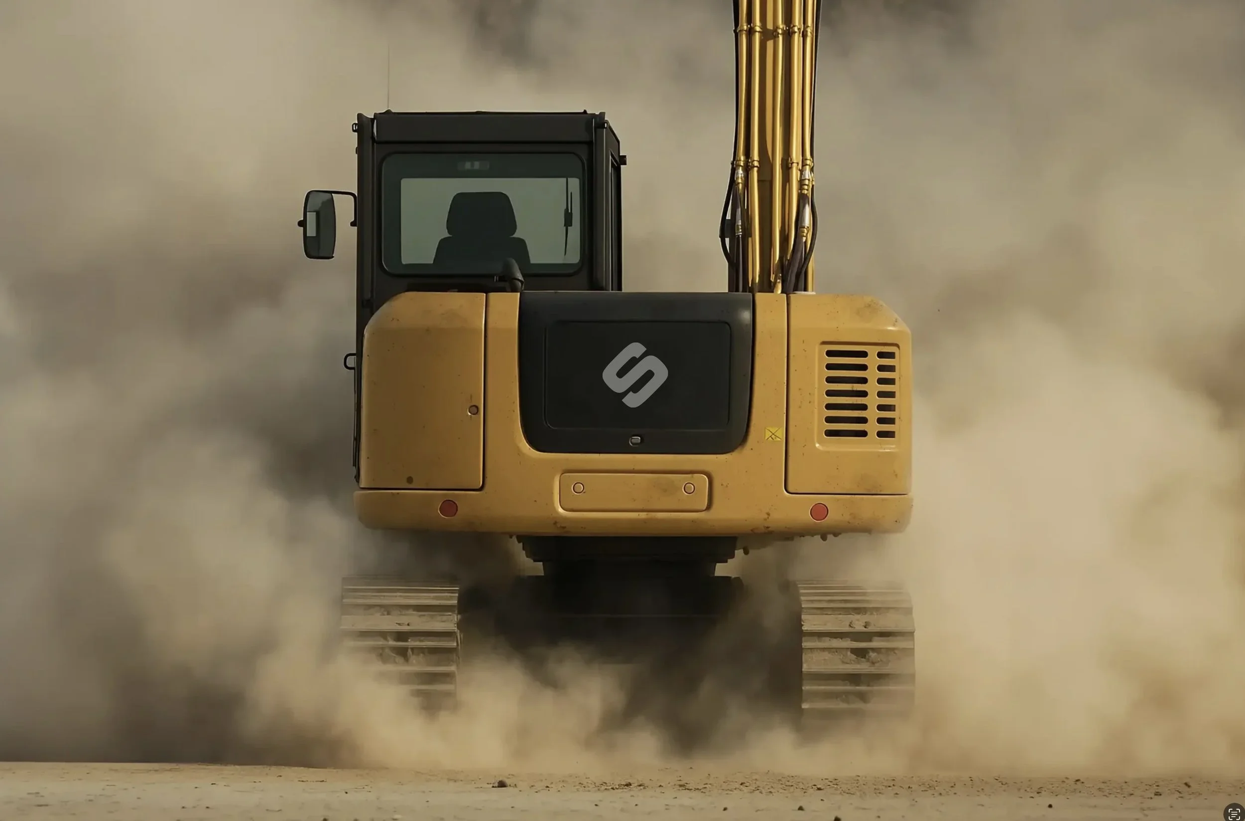
We developed a full brand identity system for Strider built around a chain link logomark: a symbol of connection, strength, and reliability. It reflects Strider's role as the central link between clients, trades, timelines, and budgets, the keystone that holds a project together when everything else wants to pull apart.
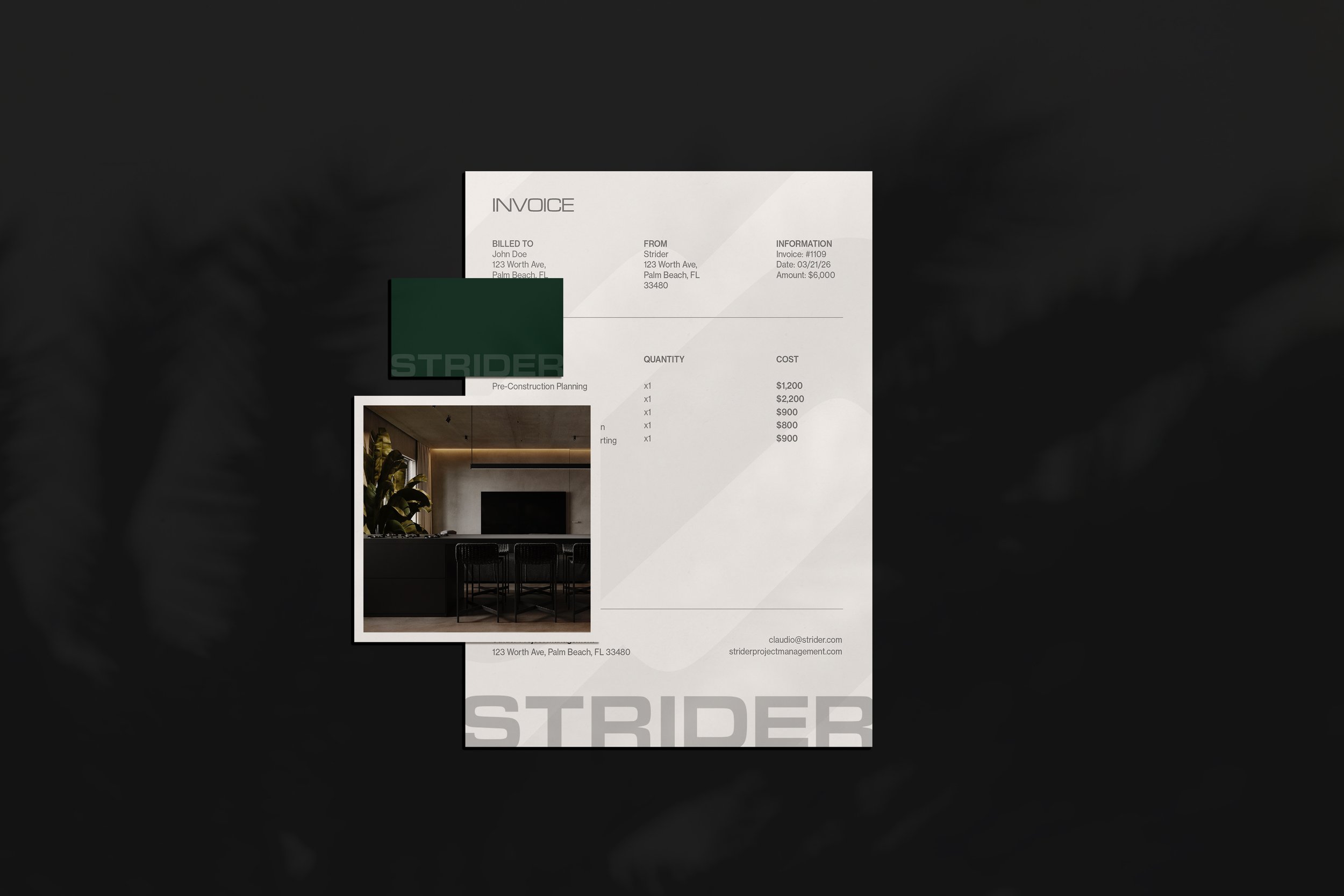
The typography carries that role through every touchpoint. A bold sans serif with a solid, even build was selected for its structural weight, so each headline reads with the same strength as the mark itself and presents Strider as an anchoring force in every project it manages. Deep forest green completes the system, lending the brand an established presence that reflects the management team's legacy and experience, even in a market where Strider is new.
We positioned Strider as a trusted construction partner as it entered the South Florida market.
Client
Strider Project Management
Services
Brand Identity